APQC Brand Guidelines
Logo Guidelines
Centerwide and APQC Logos
Before using the APQC logo, please familiarize yourself with the guidelines below to ensure proper and consistent use across all materials.
Anyone displaying an APQC logo should follow the signature guidelines for colors, safe zones, and usage as outlined below.
- The APQC corporate signature includes the letters “APQC” in 100 percent black and the “swoosh” in PMS 1797. If printing in 4-color process, convert PMS 1797 to c2 m98 y85 k7.
- Half the cap height of “APQC” determines the safe zone around the corporate signature. This area should be clear of all pattern, imagery, and objects.
- The APQC corporate signature can also be used in grayscale with the “swoosh” in 40 percent black.
- The APQC corporate signature can be reversed out to white on dark colors. On light colors, the APQC corporate signature should be used in grayscale.
CORPORATE SIGNATURE SAFE ZONES
1/2 the cap height of “APQC” determines the safe zone around the corporate signature.
This area should be clear of all pattern, imagery and objects.

A range of APQC logo color versions exists, each intended for a specific purpose.
Whenever possible, the full-color APQC logo with registered trademark should be used.

The APQC corporate logo can also be used in grayscale with the “swoosh” in 40% black. The APQC corporate logo can be reversed out to white on dark colors. On light colors, the APQC corporate logo should be used in grayscale.

CORPORATE LOGO INCORRECT USAGE
- Do not change the color of “APQC” or the “swoosh” to any color other than what is outlined in this guide.
- Do not remove or move the “swoosh” within the logo.
- Do not use the corporate signature in color on dark colors.
- Do not use the red “swoosh” on any color.
- Do not use the corporate signature on a busy or detailed pattern.
Examples of the correct usage and some incorrect variations of the APQC logo.

Over a photograph
The APQC logo might appear over a photograph or video, where the backgrounds are complex or moving. In these contexts, the white APQC logo should be used to retain clarity, unless the vendor or publication specifically requires a full-color version. Then this would be up to the discretion of the APQC marketing department.

Rules for special effects
The APQC logo should never be altered beyond its current approved version. This includes adding fanciful effects such as a drop shadow, 3-d appearance, or glows. An APQC team member should never modify any aspect of the APQC corporate logo, as they are not authorized to do so. Older versions of the APQC logo are part of the old brand and therefore are not currently approved and should not be used under any circumstances.

APQC offers electronic copies of The Grayson Guarantee℠ logo in various file formats for printing or Web use. To obtain the proper file format and secure approval for use of the logo, please contact a member of the marketing team.
Any partner displaying The Grayson Guarantee logo should follow the logo guidelines for colors, safe zones, and usage as outlined below.
- The Grayson Guarantee logo includes the letters “GG”. The first “G” is gray PMS 425c and the second “G” is PMS 541c.
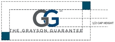
- Half the cap height of “GG” determines the safe zone around the logo. This area should be clear of all pattern, imagery, and objects.
- The Grayson Guarantee logo can also be used in grayscale.
- The Grayson Guarantee logo can be reversed out to white on dark colors. On light colors, the Grayson Guarantee logo should be used in solid black.
Corporate logo safe zones
1/2 the cap height of “GG” determines the safe zone around the logo. This area should be clear of all pattern, imagery and objects.
Approved Descriptions & Trademarks
APQC APPROVED DESCRIPTIONS HAVE BEEN ADDED TO ALL WORD AND PUBLISHER TEMPLATES FOR YOUR USE WHEN APPLICABLE.
- If the “About APQC” description exists in the template you are using, it must remain somewhere in the final version.
- All PowerPoint presentations are required to use one of the provided title slides that include the boilerplate description.
- All APQC press releases or partner releases must include the 84 word description.
DESCRIPTION – 17 WORDS
APQC is the world’s foremost authority in benchmarking, best practices, process and performance improvement, and knowledge management.
DESCRIPTION – 27 WORDS
APQC helps organizations work smarter, faster, and with greater confidence. It is the world’s foremost authority in benchmarking, best practices, process and performance improvement, and knowledge management.
DESCRIPTION – 68 WORDS
APQC helps organizations work smarter, faster, and with greater confidence. It is the world’s foremost authority in benchmarking, best practices, process and performance improvement, and knowledge management. APQC’s unique structure as a member-based nonprofit makes it a differentiator in the marketplace. APQC partners with more than 500 member organizations worldwide in all industries. With more than 40 years of experience, APQC remains the world’s leader in transforming organizations.
DESCRIPTION – 84 WORDS
APQC helps organizations work smarter, faster, and with greater confidence. It is the world’s foremost authority in benchmarking, best practices, process and performance improvement, and knowledge management. APQC’s unique structure as a member-based nonprofit makes it a differentiator in the marketplace. APQC partners with more than 500 member organizations worldwide in all industries. With more than 40 years of experience, APQC remains the world’s leader in transforming organizations. Visit www.apqc.org, call +1.713.681.4020, or follow @APQC and learn how to Make Best Practices Your Practices®.
The following includes some guidelines on how to use and reference APQC-related and -owned terms that have been (or are in the process of being) approved by the United States Patent & Trademark Office (USPTO).
HOW TO DENOTE PROTECTION
- The first instance of the use of a protected term in a document (e.g., proposal, brochure, web page, presentation, article, etc.) should include the full term and the specific protection designation immediately following it. Subsequent mentions in the same document are not required to include the protection marks.
- The ® or ™ mark should be used with each term.
- At this time, most APQC marks are officially “registered” marks, meaning that they have been fully approved by the USPTO. Those marks should thus include the circle R symbol to indicate that they are Registered: ®.
- When terms are in the process of being protected as are a few APQC marks, the symbol to use is the superscript TM or SM format as opposed to the circle R format. The TM format is typically used to reference product-related terms though it is also acceptable to use for service-related terms. The SM format is used for service-related terms only.
- Once a term is fully approved and registered, the use of the TM or SM mark changes and always is rendered as the circle R ® mark.
- At this time, most APQC marks are officially “registered” marks, meaning that they have been fully approved by the USPTO. Those marks should thus include the circle R symbol to indicate that they are Registered: ®.
- Marks that are a company name or tagline may stand-alone, such as APQC®. In general, marks are adjectives and should be used as such where possible. Marks should never be used as nouns or verbs. Nor should marks be pluralized, or used in the possessive form. Non-adjectival uses of marks, over time, can result in generalness, or a finding of unintentional abandonment.
- One way to ensure that a mark is used in proper adjectival context, is to follow each use with the generic noun for the product identified, such as the Open Standards Benchmarking® database.
- In text, it is helpful if the mark stands out from the rest of the text, such as all caps, italicized, stylized, etc
- One way to ensure that a mark is used in proper adjectival context, is to follow each use with the generic noun for the product identified, such as the Open Standards Benchmarking® database.
QUESTIONS ON USE:
Paige Dawson [email protected], 214-744-6188
-
List of Currently Protected Marks: APQC TM Full Roster
Email Signatures
The approved APQC email signature uses only the Calibri typeface with regular, bold, and italic fonts. For technical and accessibility reasons, the signature does not include an image of the APQC logo or any other graphic. To ensure that you are using the correct, current email signature, a Word template has been set up under the Marketing Vault site for you to easily cut and paste the approved formatting into your Outlook signature settings.
How it should look
Outgoing Messages
…………………………… (periods to extend to the end of the line that contains “Job title, APQC”)
FirstName LastName
Job title | APQC
Direct: +1-713-685-#### | Mobile: +1-713-###-#### (Optional) | Fax: +1-713-###-#### (Optional) | Main: +1-713-681-4020
Email: [email protected] | Web: www.apqc.org
(Optional elements) LinkedIn: www.apqc.org/linkedin | Twitter: @apqc | Blog: www.apqc.org/blog | Facebook: www.apqc.org/facebook
APQC, the world’s foremost authority in benchmarking, best practices, process and performance improvement, and knowledge management.
This email message and any attachments are for the sole use of the intended recipient(s). Any unauthorized review, use, disclosure or distribution is prohibited. If you are not the intended recipient, please contact the sender by reply email and destroy all copies of the original message and any attachments. To reply to our email administrator directly, send an email to [email protected]
Reply Messages
FirstName LastName
Job title | APQC
Direct: +1-713-685-#### | Mobile: +1-713-###-#### (Optional) | Fax: +1-713-###-#### (Optional) | Main: +1-713-681-4020
Email: [email protected] | Web: www.apqc.org
Email Signature Styles
- Signature: Font – Calibri | Font Color – Black | Font Size: 9 point
- Tag: Font – Calibri | Font Color – Black | Font Size: 9 point
- Legal: Calibri | Font Color – Black | Font Size: 8 point
Instructions on changing your signature line
- In Outlook, under File click Options> Mail> Signatures
- Select the signature to edit or click new (if new, type the name for the signature)
- Type your signature and select your font styles
- Click OK
Typefaces and Color Palette
The APQC corporate brand uses Arial and Calibri as primary typefaces. Strong, consistent typography is integral to the success and impact of our brand.
Arial narrow bold is the approved APQC brand header typeface
|
Arial Narrow abcdefghijkABCDEFGHIJK 0123456789 |
Arial Narrow Italics abcdefghijkABCDEFGHIJK 0123456789 |
|
Arial Narrow Bold abcdefghijkABCDEFGHIJK 0123456789 |
Arial Bold Italics abcdefghijkABCDEFGHIJK 0123456789 |
Calibri is the approved APQC brand body typeface
|
Calibri abcdefghijkABCDEFGHIJK 0123456789 |
Calibri Bold abcdefghijkABCDEFGHIJK 0123456789 |
|
Calibri Bold Italics abcdefghijkABCDEFGHIJK 0123456789 |
Calibri Light abcdefghijkABCDEFGHIJK 0123456789 |
|
Calibri Italics abcdefghijkABCDEFGHIJK 0123456789 |
Primary Colors

Secondary Colors

Stock Images
Stock imagery should feel professional, authentic, modern, and consistent with the APQC brand. Images should support the message or concept being communicated rather than serve as decoration.
When selecting imagery:
- Choose high-quality images. Images should be sharp, properly sized, and high-resolution. Avoid pixelated, blurry, stretched, or poorly cropped images.
- Keep imagery authentic. Select natural, credible photography that reflects real people, workplaces, industries, and business environments. Avoid images that feel overly staged, artificial, or cliché.
- Consider the APQC brand. Imagery should complement APQC's professional, knowledgeable, and contemporary visual identity. Look for clean compositions and images that work well alongside APQC's colors, typography, and graphic elements.
- Choose images with purpose. The image should reinforce the topic or message. Avoid selecting an image simply because it loosely relates to a keyword.
- Keep imagery current. Clothing, technology, office environments, equipment, and other visual details should feel contemporary unless historical context is intentional.
- Consider diversity and representation. When people are featured, select imagery that represents a broad and authentic range of people, roles, industries, and work environments.
Image No-No's
As the APQC brand evolves, outdated and overly generic visual styles should be left behind. Do not use:
- Clip art or cartoon-style business graphics
- Pixelated, blurry, distorted, or low-resolution images
- Noticeably outdated stock photography
- Overly staged or exaggerated stock-photo scenarios
- Generic business clichés, such as forced handshakes or exaggerated reactions
- Images with distracting watermarks, logos, text, or branding from another organization
- Imagery that does not clearly support the subject or message
Quick check: Before using an image, ask: Does this feel current, credible, professional, and distinctly appropriate for APQC? If not, choose another image.
Icons should be simple, consistent, professional, and aligned with the APQC visual brand. They should help communicate or reinforce an idea without adding unnecessary visual clutter.
- Use high-quality icons. Icons should always appear sharp, clean, and properly scaled—never pixelated, stretched, or distorted.
- Stay within the APQC color palette. Use only approved brand colors and maintain appropriate contrast for readability.
- Keep styles consistent. Icons used together should share a similar visual style, line weight, level of detail, and overall appearance.
- Use icons with purpose. Select icons that clearly represent the intended concept and are easy for the audience to understand.
- Use approved resources. Approved icons are available in the APQC image repository. If a specific icon or color variation is needed, request one rather than creating or sourcing an inconsistent alternative.
Avoid: clip art, overly detailed illustrations, mismatched icon styles, unapproved colors, low-resolution graphics, and decorative icons that do not support the content.
**Helpful tip: Icons can be downloaded from flaticon.com. In order to download icons, a user can register with the site which is free or send the url of the icon of your choice to the graphics department and they can get it for you.

Style Guides
You can access the Quantitative Data Display Standards here.
APQC Writing Style Guide
APQC written materials should follow the spelling, usage, style, and punctuation rules laid out in the most recent versions of The Associated Press Stylebook and Webster’s New World College Dictionary. Exceptions are specifically listed in this guide.
Templates
Before you begin working with the PowerPoint template, you must determine if your content is intended for screen or print. The answer to this question will determine how you use the template. If you intend to display the presentation on-screen and also hand out printed versions, you will need to find a middle ground for how to handle your content. The universal rule for any content on a presentation slide is to KEEP IT TO A MINIMUM.
Screen Presentations
A general rule of thumb for any speaker is not to rely on the screen during your presentation. Your audience is listening to YOU, they’re not meeting with you to hear you read off a bulleted list. As an industry expert, your topic should be second nature. Imagine a power outage occurring in the middle of your presentation. Could you carry on relying solely on your knowledge and speaking skills? How would you present your material to someone sitting in the last row, or to someone who is visually impaired?
Screen presentations require a larger type with less content on a single page. Type size for screen should never go below 12 points and situations of low contrast should be avoided (i.e., placing type atop a zone of similar color renders it unreadable). Test out your presentation on-screen before the day of your meeting to safeguard against low readability and possible technical issues. The next time you’re at a presentation someone else has prepared, pay attention to their content decisions. Is the screen loaded with miniscule text and complicated graphics that are impossible to read? Or is visual integrity preserved with generous margins, clear, minimal text, and simple, elegant graphics that match the corporate colors? Common sense is your guide at all times.
In the context of screen display, the footer art serves as a buffer in the event that the bottom of a screen is cut off by the projector or blocked by the heads of people in the audience. Do not place content near the footer for this reason. The projector cutoff rule also applies to the left, right, and top margins, which should never contain content.
Printed Presentations
When developing a deck for print, you have more flexibility in type size and the amount of content that can fit on a single line. Text that appears inside tables and charts can be as small as 6pt, depending on your audience. However, consider the real value of cramming too much information onto one slide. Ask yourself honestly if you think each slide in your deck is readable, clear, and organized. Sometimes we must make the decision to break up information to two or three slides to keep it digestible. Sometimes content needs to be distilled by summarizing points or breaking long sentences into lists. Avoid putting content in the safe areas for printed decks. The safe areas are also in place to guard against a printer’s printable area, or a hole punch’s registration, cutting off your content.
| Title Text: | Subhead Text: | Body Text: |
| Font: Open Sans Bold | Font: Open Sans Bold | Font: Calibri |
| Color (r,g,b): 187, 107,14 | Color (r,g,b): 112, 144, 183 | Color (r,g,b): 0, 0, 0 |


We have created multiple types of templates in Word for your use. For all standard documents, the general document template should be used. All Word templates include the approved APQC logo, header and footer with tab element, and sample text using the APQC color palette and styles.

Video Presentation Guidelines
To access Zoom, please sign in using SSO (Single Sign-On) with your APQC email address.
Zoom Login and Video Settings
To access Zoom, please sign in using SSO (Single Sign-On) with your APQC email address.
Your Zoom settings have already been configured to support APQC's virtual meeting and recording standards, so no additional setup or changes are needed.
If you have any trouble signing in or accessing Zoom, please contact IT for assistance.
Zoom Video & Recording Standards
- Video Quality: Use HD video (1080p when available) for recordings, webinars, and external-facing meetings.
- Camera Position: Position your camera at or slightly above eye level and frame yourself from approximately the chest or shoulders up.
- Lighting: Face a natural or soft light source so your face is evenly lit. Avoid bright windows or strong lighting directly behind you.
- Background: Use a clean, professional, distraction-free background or an APQC-approved virtual background when appropriate.
- Audio: Use a quality headset or microphone and keep background noise suppression enabled.
- Internet Connection: Use a stable, high-speed connection. A wired Ethernet connection is preferred for important webinars and recordings when available.
- Before Recording: Preview your camera, lighting, background, and audio. For external-facing or high-visibility content, complete a brief test recording before beginning.
Microsoft Teams Login and Video Settings
To access Microsoft Teams, please sign in using your APQC Microsoft 365 account and APQC email address.
Before participating in virtual meetings or recordings, make sure your camera, microphone, and audio settings meet APQC's virtual meeting and recording standards that are listed below.
If you have any trouble signing in, accessing Teams, or configuring your audio or video, please contact IT for assistance.
Teams Video & Recording Standards
- Video Quality: Use the highest available video quality for recordings, webinars, and external-facing meetings.
- Camera Position: Position your camera at or slightly above eye level and frame yourself from approximately the chest or shoulders up.
- Lighting: Face a natural or soft light source so your face is evenly lit. Avoid bright windows or strong lighting directly behind you.
- Background: Use a clean, professional, distraction-free background or an APQC-approved Teams background when appropriate.
- Audio: Use a quality headset or microphone and keep noise suppression enabled to minimize background sounds.
- Internet Connection: Use a stable, high-speed connection. A wired Ethernet connection is preferred for important webinars and recordings when available.
- Before Recording: Preview your camera, lighting, background, and audio. For external-facing or high-visibility content, complete a brief test recording before beginning.
How to upload your virtual backgrounds:
Zoom
- Open Zoom and click your profile picture → Settings.
- Select Background & Effects.
- Under Virtual Backgrounds, click the + button.
- Choose Add Image and select your background.
- Click the image to apply it.
Microsoft Teams
- Open Teams and join or start a meeting.
- Click More (•••) → Video effects and settings.
- Select Video effects → Add new.
- Upload your background image.
- Select the image and click Apply.