As we recently discussed, process and technology are deeply entwined. Not only are process teams tapped to support technology implementations—both large and small—but they are expanding their toolkit with more technologies.
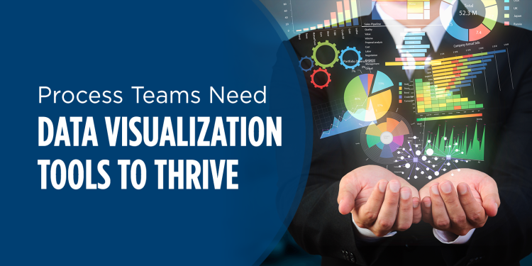
One of the key technologies that process teams use is data visualization tools.
Why Data Visualization Tools?
Data visualization tools are typically connected to dashboards and better reporting—by ensuring timely access to information and insights. This helps drive better data-based, decision-making and getting information into the hands of decision-makers when they need it.
In our recent poll on data visualization, we found that there are three reasons for the implementation of most data visualization tools:
1. One Source of Truth—by developing dashboards organizations make data accessible and create a one-stop-shop for insights and information. This also helps organizations move away from clunky monthly reports—often in Excel or PowerPoint—that are isolated in access restricted SharePoint sites or team folders.
2. Usability—data visualization tools make identifying insights easier by taking complex data and transforming it into easy-to-understand visuals. In addition to making information easier to understand, teams can also include storytelling components that provide context around the insights to ensure decision-making isn’t conducted in a vacuum.
3. Timeliness—extraction, transformation, and loading (ETL), algorithms, and other forms of automation help put information in the hands of decision-makers when they need it. This helps organizations overcome cycle time challenges and improve data-driven decision-making.
What Holds Team Back?
With even the best of intentions, most organizations face a few snags when it comes to implementation and adopting new tools.
The poll also uncovered four key themes around the implementation challenges of most data visualization tools:
1. Training—because the goal is to take complex information and relay it in easy-to-understand visuals, it’s important to train those creating the visuals on good visual design. Additionally, you must ensure that the decision-makers consuming the visuals understand how to interpret them and have a basic understanding of data and analytics applications and outputs.
2. Flexible Design—one struggle with using a dashboard as a one-stop-shop for insights is the varying needs of different stakeholders. Some stakeholders need high-level information or prescriptive advice around the data. While others want to be able to drill into the details of the analysis and identify root causes behind performance variances.
3. Inconsistency—most process teams report that the tools and technologies that they use in their efforts are ad hoc or only standardized with specific departments. This is also true of data visualization tools, a lack of consistent tools used across the organization can either cause or exacerbate other challenges around implementation. Inconsistent tools make it hard for organizations to:
- develop training, guidance on applications, and visual standards;
- reduce additional investments to manage integrations with systems or databases;
- avoid duplicative dashboards, reports, or information; and
- create a consistent experience for end-users, which can result in rejection of the tools.
4. Garbage in, Garbage out. Data quality is foundational to effective visuals. If the data is unreliable or not fit for purpose, the output of the analysis is unreliable insights that decision-makers can’t trust, which ultimately reduces the use of data visualization tools. Data quality and ensuring the collection of the appropriate data should be part of the iterative methodology for dashboard and analytics projects.
Overall data visualization tools are an important component of process teams’ toolkit. They help drive objective decision-making around the performance of work and related processes. If done correctly they not only create transparency around performance but make it easier for decision-makers to identify opportunities for improvement. But to ensure that the business actively uses these insights teams need to engage decision-makers on their needs and applications for the outputs of these tools and leverage other tools to increase the cycle time of extraction, transformation, and loading data and analysis.
For more information on this topic and the poll results check out: Dive into Data Visualization.
For more process and performance management research and insights, follow me on Twitter at @hlykehogland or connect with me on LinkedIn.